Koi Flow | Wisconsin, USA

I was asked to develop the logo and brand identity for the new machine-learning and data company, Koi Flow. Their focus is providing rapid insights and modeling for the Healthcare industry and wanted their brand to feel like it.
They also wanted to convey a sense of disruption without being so disruptive as to alienate potential clients. Finding that sweet spot is what made this identity really sing!

In the initial round of logos we explored various themes related to data, machine-learning, and the brand’s namesake: koi fish.
I tried various forms and shapes before refining down to these five selections. I wanted to show designs that conveyed “flow” without being too “fishy” and “data” without being “boring”.
The chosen concept was a play on a simplified fish shape to create a brand symbol and a stylized letter “K” that integrates into the logtype.
In their moodboard round, they liked the idea of something that was professional and innovative with a youthful quality linked to their nimbleness with their insights turnarounds.
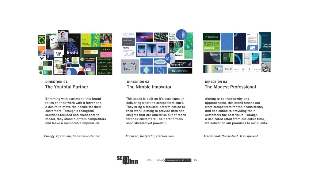
After final logo selections and a chosen moodboard (Direction 02, I spent quite some time just playing with the brand and devising different personalities that I thought fit within the “The Nimble Innovator” archetype I’d created. Ultimately, the client went with a combination of several directions and really wanted a salmon/coral color incorporated.
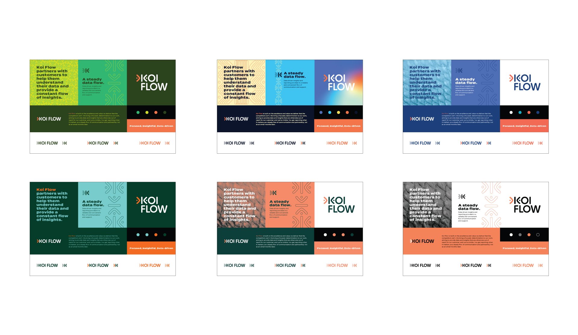
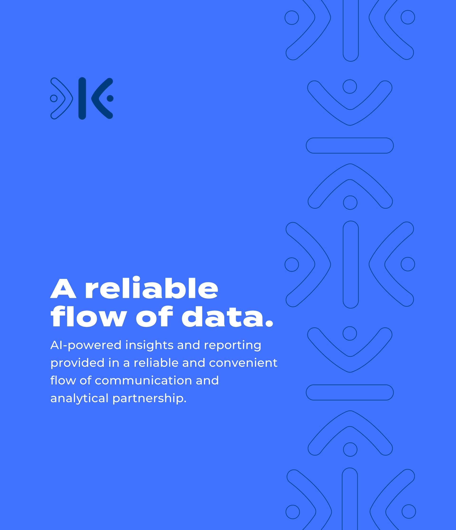
The resulting brand has playful and exciting elements, but is set into a smart, clean environment and brand personality. The use of sophisticated yet rounded typefaces help blur the lines between clinical and approachable messaging while the use of thin, monoline patterns gives a sense of movement and energy.
Koi Flow’s new brand has the legs to last them as they grow into the healthcare space and gives them a platform and an attitude that is all their own.

Thanks for viewing!
— SQ