Brian Head Resort | Utah, USA
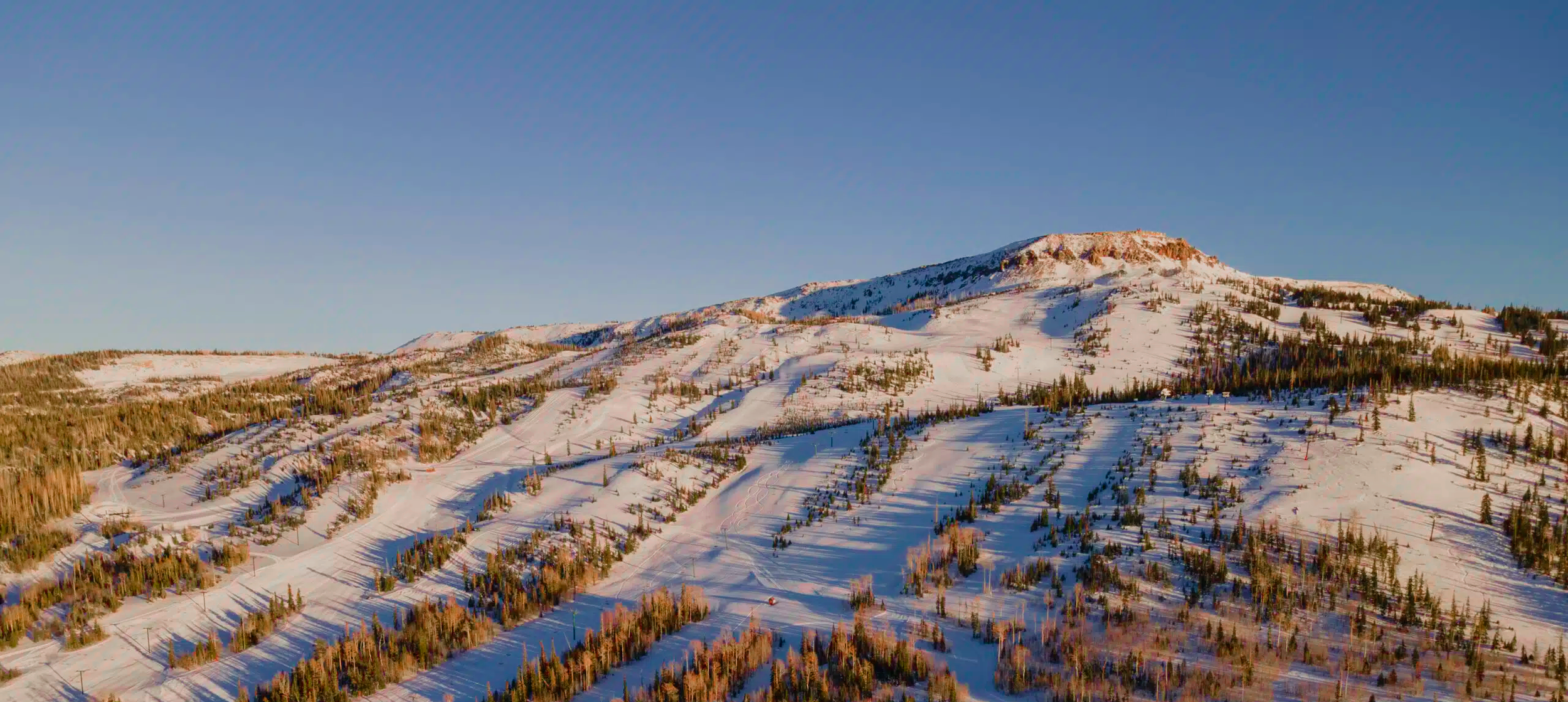
I had the opportunity to present some logo concepts to Brian Head Resort in Southern Utah. Uniquely situated a top a high mountain plateau overlooking red rock desert gorges, there was plenty of imagery to be inspired by.

While none of my concepts made the cut, it was super fun to develop these ideas following a rather unconventional design process. Essentially, I was tasked with creating as many “symbol” concepts as I could. The client would “know it when he saw it”.
Guidelines for development were to work toward something relatively simple that lent itself to multiple color usages and that played into the nature of the winter sports industry (stickers, posters, park features, etc.)
After an initial symbol set, I presented and refined the selections and began to think about basic type pairings. At this stage, the loose rationale I’d come up with in the first round began to take more robust shape.
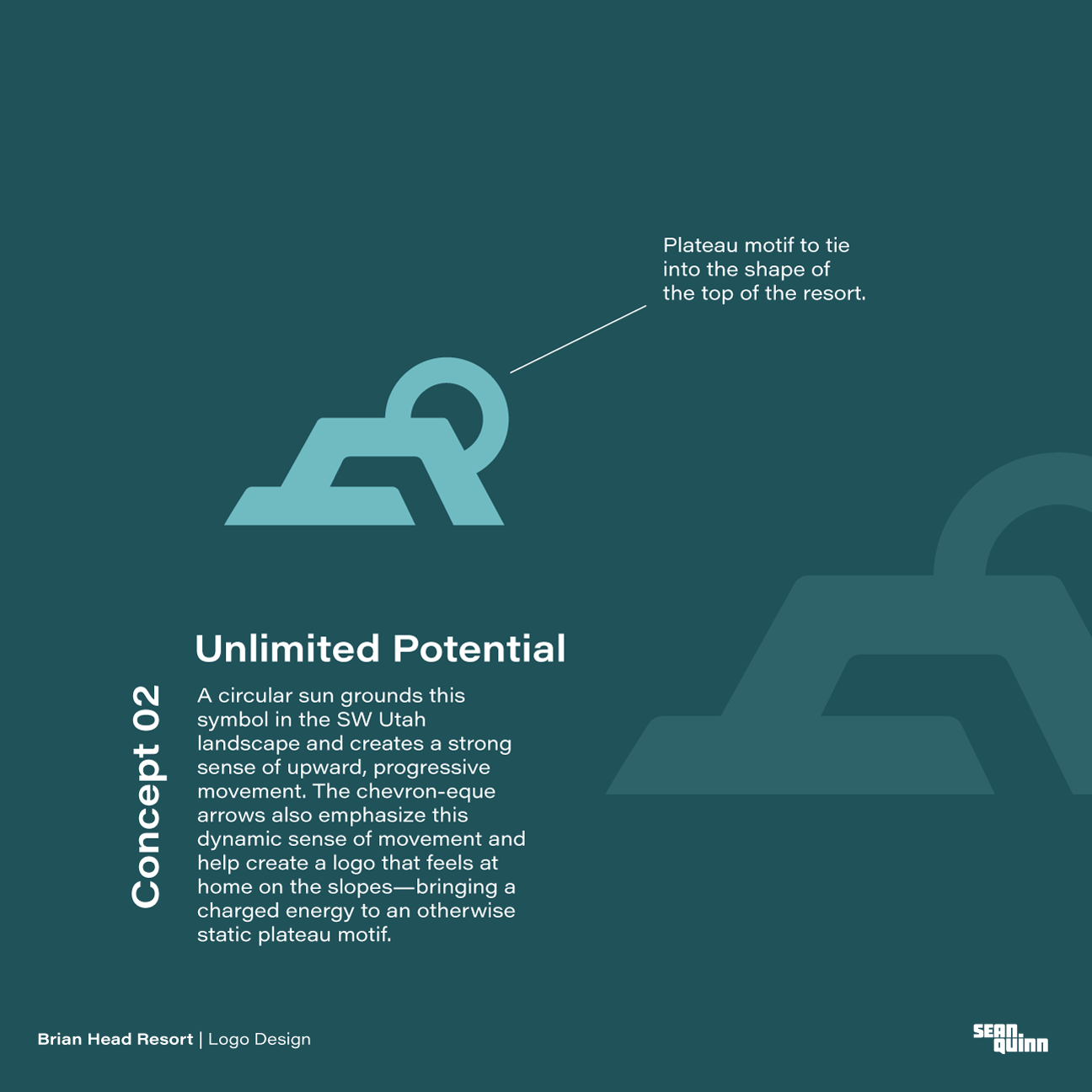
Motifs of the plateau itself were the main focus as well as elements of snowflakes or generalized upward and energetic movement. The client was interested in conveying the “otherworldly” nature of the resort and the “top of the world” feeling one gets there looking out over the desert from the peak.
After narrowing things down to the two most promising concepts. I fleshed out the brand around them to help show how it could live on the mountain.
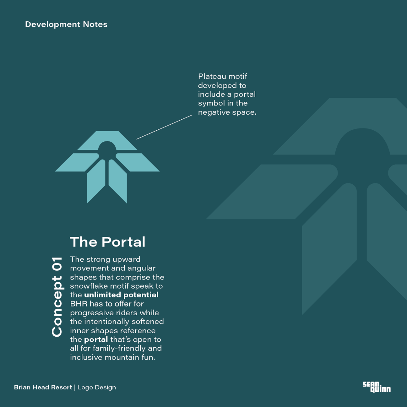
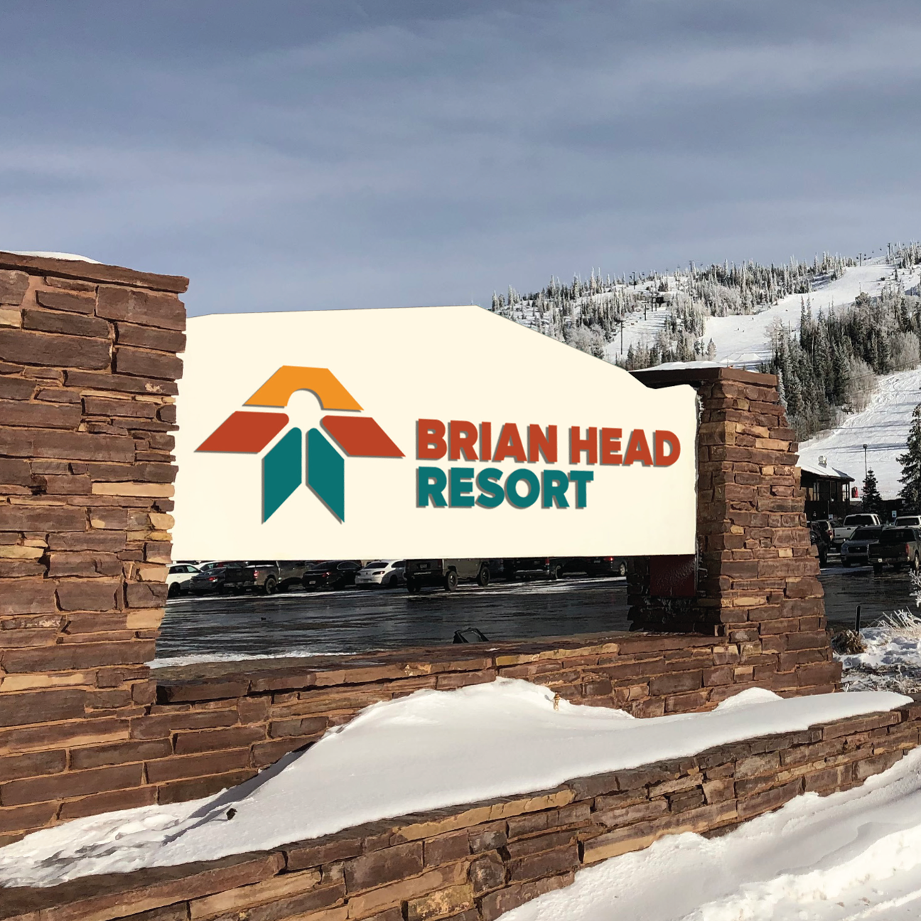
The portal concept was my favorite. It referenced inclusive, all-mountain fun as well as progression for advanced riders. It has energetic forms that work in many colors and lends itself to stickers or apparel. It also has a subtle southwest vibe to it with the snowflake motif made up of diamond shapes.

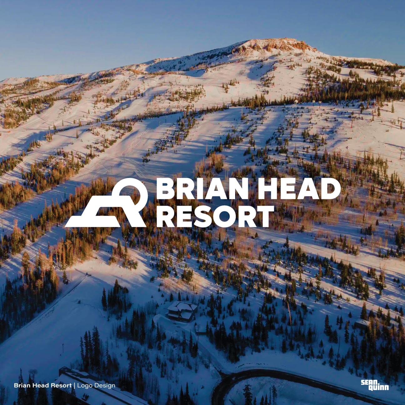

Again, while none of my ideas made the cut, it was a fun project. It brought me back to my roots creating apparel for the action sports scene in my hometown and working with other riders. If you have a project like this or a logo/brand in general I’d love to throw some ideas your way!
Thanks for viewing!
— SQ


