GITS MANUFACTURING | IOWA, USA

While working as Senior Designer at Thiel Brand Design, I was asked to develop the logo and brand identity for the airflow manufacturing leaders, GITS MFG CO. As a long time industry player, This wasn’t the first time GITS has rebranded.
For this go around, the goal was to update and modernize the existing, Times New Roman logo and better convey who they were as a company looking ahead to the future.

The previous brand logo & identity.
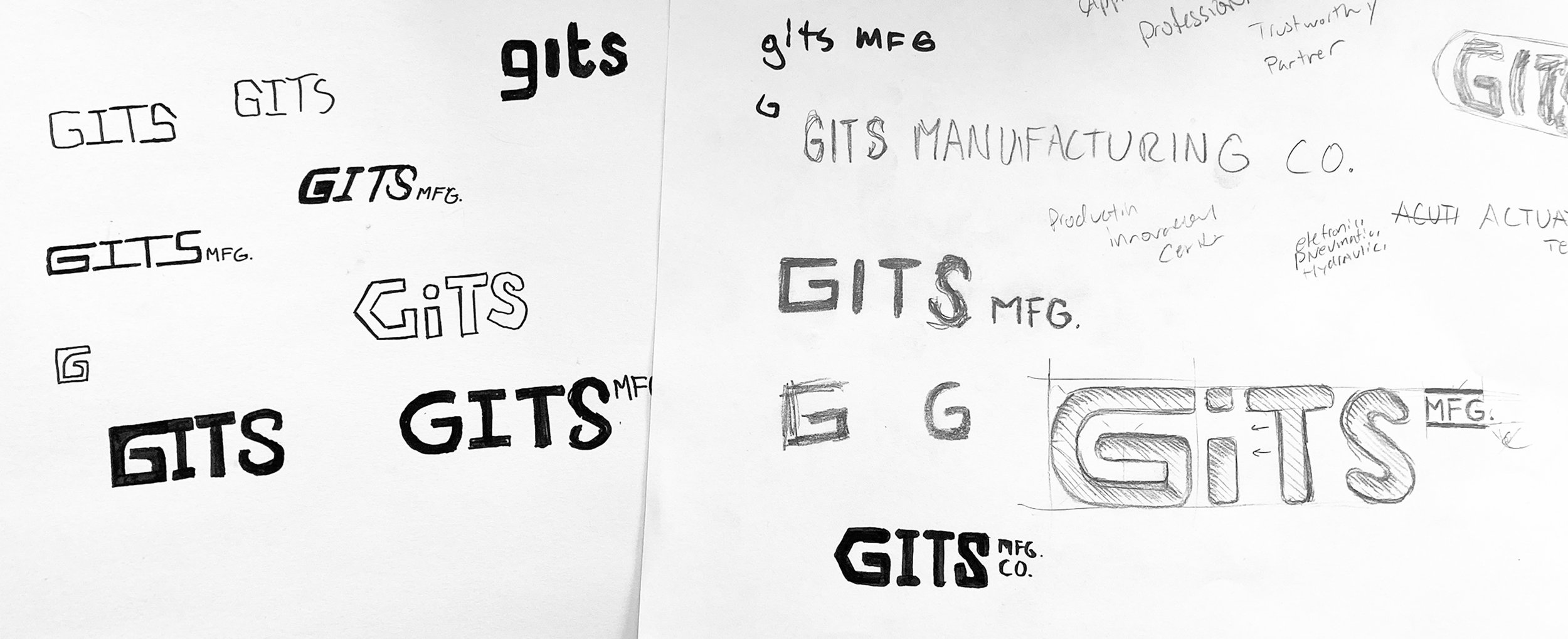
Initially, I was tasked by my Creative Director, Chris Taylor, to develop “G” monograms that could later be paired with type. I developed a concept that conveyed the companies expertise and focus through line.
As a nod to racing logos and automotive applications, the lines convey a sense of speed and precision which perfectly blended with the companies values and expertise.
While initially favored, this concept was eventually tabled.

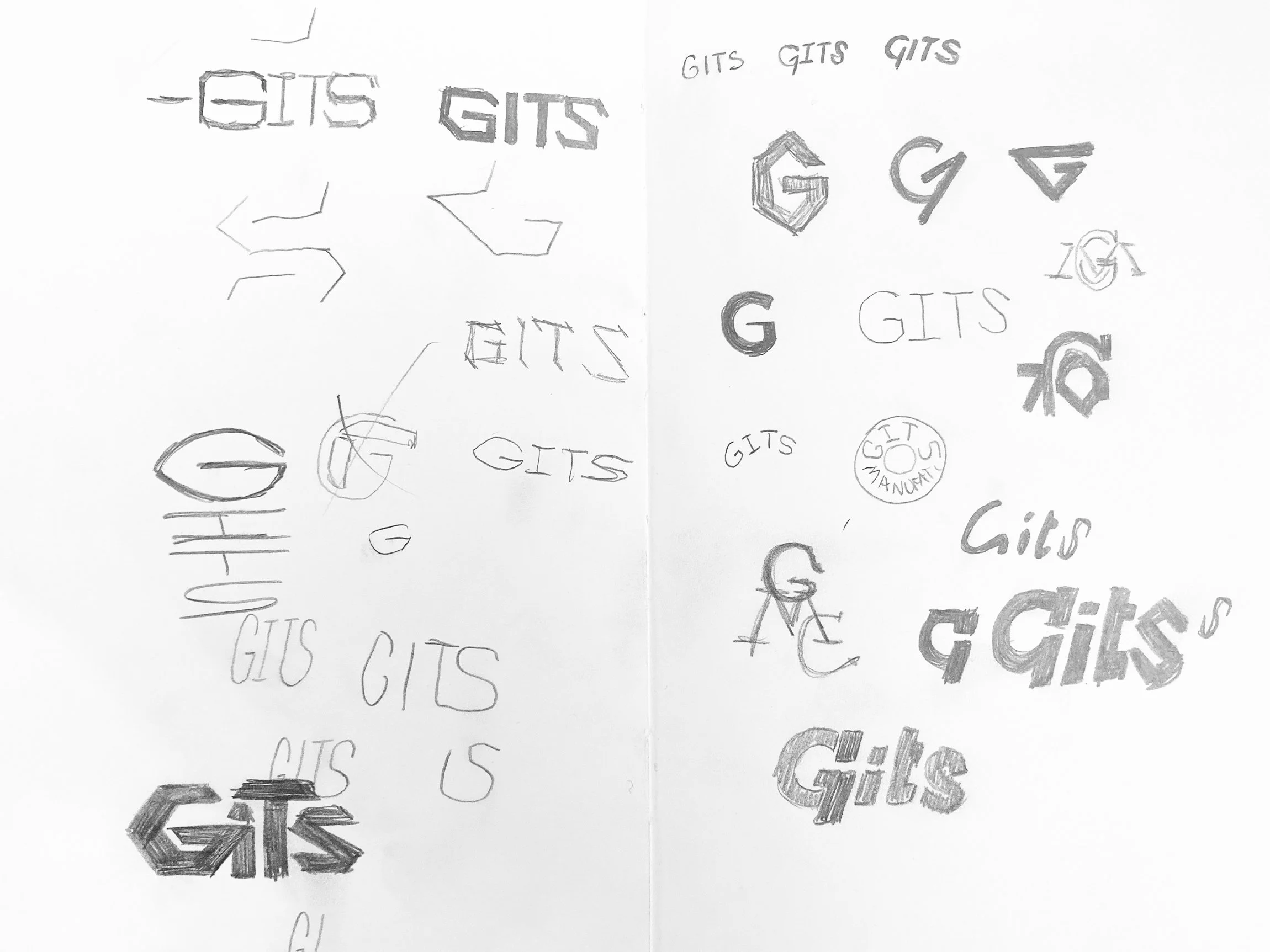
These are some of the many “G”s I developed during this stage of the project. Ultimately, my CD felt this was too many to show the client so we boiled it down to a concept each. One featuring his gear theme and mine with the in-line flow.
My final concept was based on a sturdy, weighted letter “G” and the use of line to reference “in-line flow” as a nod to the company’s technical expertise. The client ended up going with his gear concept.

During this phase of the project, I became the sole designer involved and was tasked with pairing my CD’s gear and circuitry “G” monogram with the rest of the company name. Through several rounds we landed on this iteration that conveys a sturdy, chiseled approach while still referencing some flow with the letter “S” and the interaction between the tops of the letters.
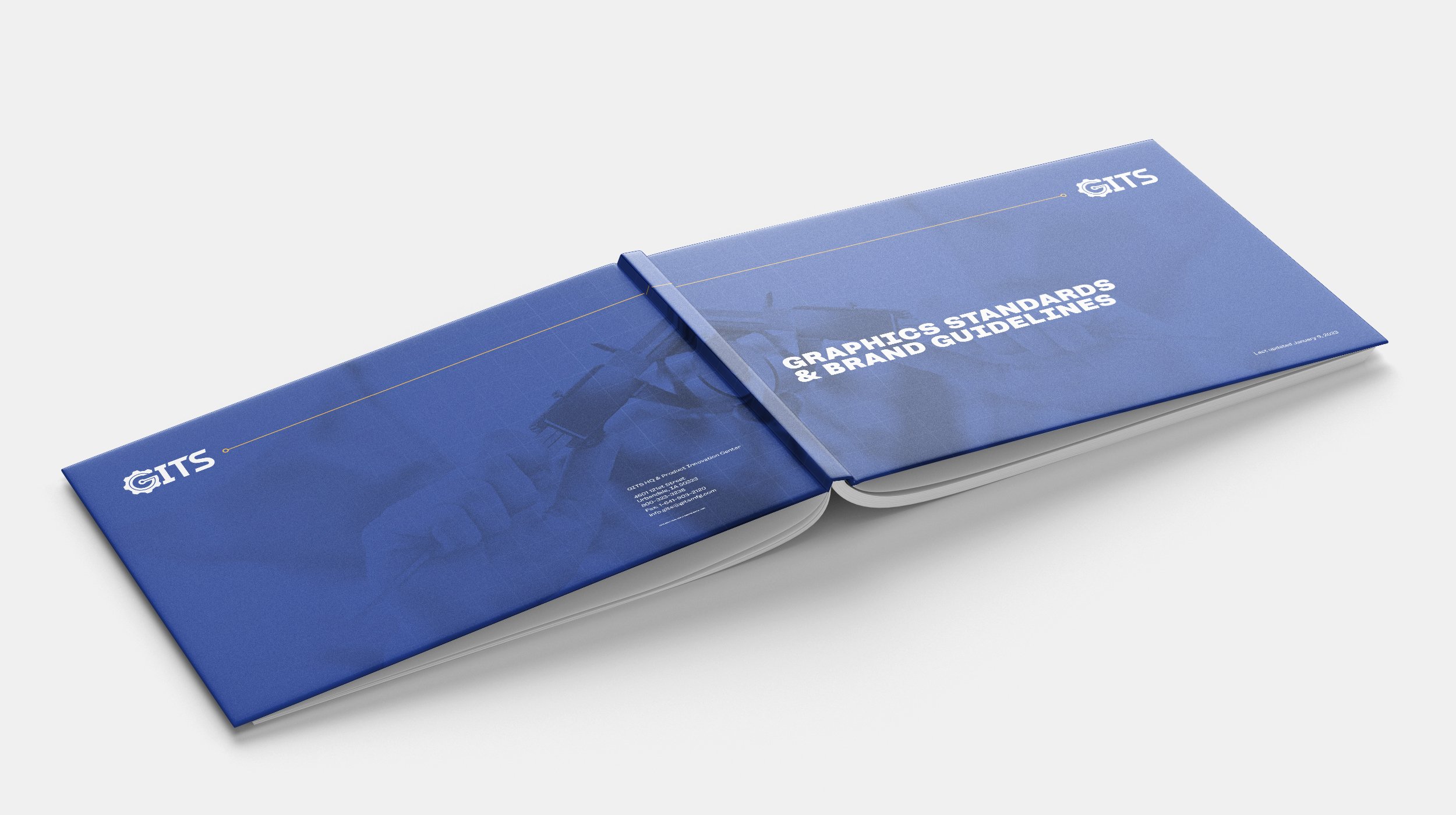
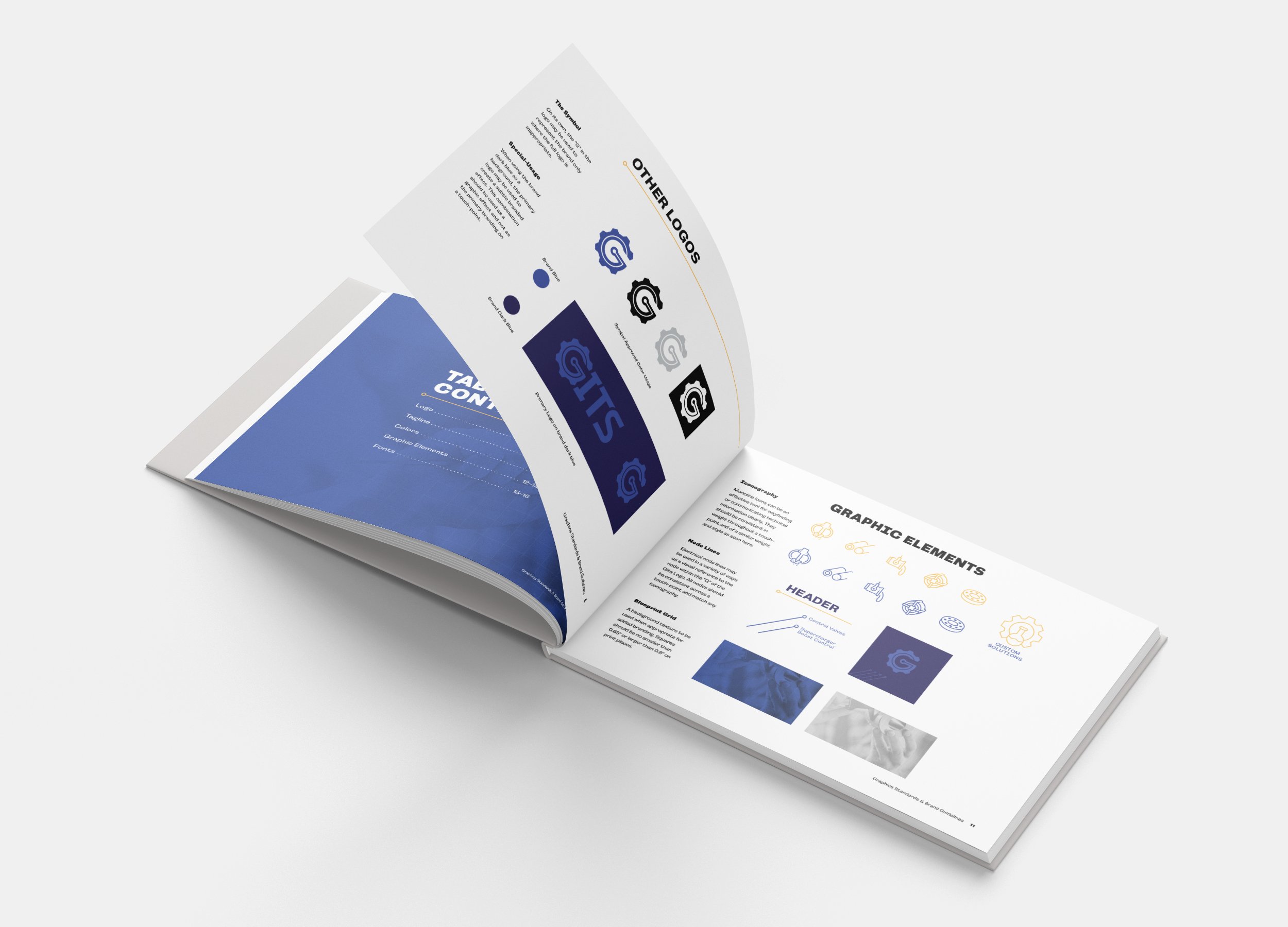
After the logo was selected, I developed a color system, type arrangements, graphic elements, and usage guidelines for the brand’s identity.
A final color selection or mood was chosen from these final arrangements, which I built into a brand guidelines document.


Since then the website and brand have been built out by the client and have really succeeded in lifting GITS from the background and helping reposition them as innovative, past-present-and-future manufacturing leaders.
The video showing GITS rebranding through the years was created by Centromotion’s animator & designer Adam Friesenhahn
Thanks for viewing!
— SQ